What Designers Must Know About Email Marketing - 7 Tips and Tricks
Этот контент еще не переведен на Русский. Мы покажем вам английскую версию ниже.
When used correctly, good design can persuade, influence, and motivate people to take action. For example, MailChimp found that simply launching a mobile-responsive email design led to a 15% increase in unique clicks.
That’s why designers are so valuable to businesses — they boost the power of email marketing and allow you to reach a large audience with a personalized message.
If you’re a designer, there are some things you need to know about email marketing in order to create effective campaigns. Here are 7 ideas to help you out, each with an example so you can implement it in your emails.
The 7 Email Marketing Tips Every Designer Should Know
1. Subject lines matter
Your email’s subject line is the first design element your recipients will see, so it’s important to make it count. Keep it short and sweet, and include keywords that accurately describe the contents of your email. Avoid using misleading or spammy language, as this will only create a negative impression of your brand (especially if you're sending recurring emails).
The most important thing when crafting subject lines is to think about what your recipients will find valuable. What information do they need? Why should they care about your email? If you can answer these questions, you’ll be well on your way to creating successful email campaigns.
Here’s an example of a good subject line:
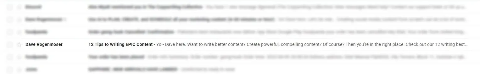
Screenshot from Jasper
Notice how it’s giving readers a clear reason to open the email (which is to be able to write better content). Also notice how the preview text follows the subject line nicely.
If you’re in the B2B space, you can make your subject lines even more effective by personalizing them. Email finders like Voila Norbert also offer email enrichment, which provides you with background information about an address, such as social media profiles.
This information can then be used to personalize every aspect of your email, from the subject line to the sign off.
2. Harness the power of emojis
Emojis are a great way to add personality to your emails and make them more engaging. They can also be used to highlight important information, such as deadlines or special offers.
When using emojis in your emails, be sure to use them sparingly as it helps to improve your open rate by 56%. But too many emojis can come across as unprofessional and can make your email look like spam.
SadaPay, a fintech solution, has been using emojis rather creatively in their emails. Here are some of their emails:
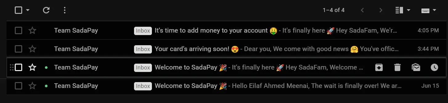
Screenshot from SadaPay
3. Don't forget to include your logo
Your logo is one of the most important design elements in your email marketing campaigns. It's a visual representation of your brand, and it should be included in every email you send.
Be sure to use a high-resolution version of your logo, as this will ensure that it looks sharp on all devices. If you're unsure about the quality of your logo, you can always create a new one (but never make the mistake of including a blurry logo).
It's also important to position your logo well. Typically, it should be placed in the top-left corner of your email. This will ensure that it's the first thing recipients see when they open your email.
Snapchat positions its logo right on top to ensure it’s prominent. Also notice how Snapchat uses white space to not only make its logo prominent, but also to guide the reader to the call-to-action (CTA), which is the “Add Friend” button in this case.
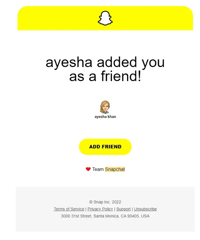
Screenshot from Snapchat
4. Make the correct use of images
65% of users prefer email to contain more images than text. Images are a great way to add visual interest to your emails and make them more engaging. However, be sure to use them sparingly, as too many images can make your email look cluttered and difficult to read.
In addition to using relevant images in your emails, you should:
- Choose the correct format. The most common image formats for email are JPEG and PNG. You should use JPEG if you want better loading times but PNG for images with a lot of text in them.
- Optimize your images for faster loading times. This can be done by reducing the file size of your images. Generally, you should keep your images under 200 x 600 pixels. However, it's a good idea to test your emails on different devices to see how the images appear before sending them to your list.
- Include alternative text (ALT text) for each image. This is important for two reasons: first, it allows recipients to still view your images even if they have image blocking turned on. And second, it helps people with visual impairments understand what's in your email. When writing your ALT text, be sure to keep it short and descriptive. For example, "A red and white banner with the words 'Sale ends soon!'"
Here’s how Blloc — a mobile productivity app — uses images in their emails:
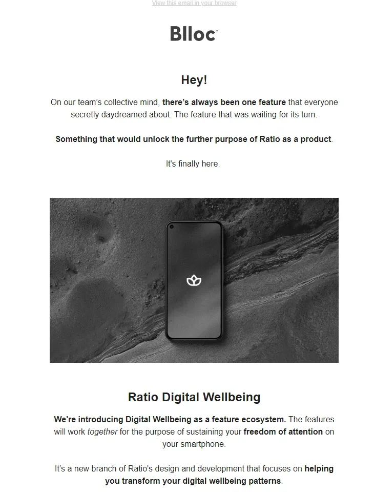
Screenshot from Blloc
Notice how the email looks clean despite the image. Plus, the color palette of the image matches that of the company’s logo. This keeps your emails consistent and helps develop a brand image in your readers’ minds, allowing them to recognize your emails instantly.
5. Use whitespace effectively
Whitespace is an important design element that should not be overlooked. It helps to break up your email and make it more readable. When used correctly, whitespace can also help to highlight important information, such as call-to-action buttons.
In general, you should aim to use whitespace sparingly. Too much whitespace can make your email look empty and uninviting. It can also get in the way of your message and the CTA, which is the most important part of your email.
However, don't be afraid to use it when necessary. A little bit of whitespace can go a long way in making your email more readable and engaging, especially on smaller devices. This is extremely important today, where 81% of emails are read on mobile phones.
Canva makes excellent use of white space to guide the reader to the CTA button in this email:
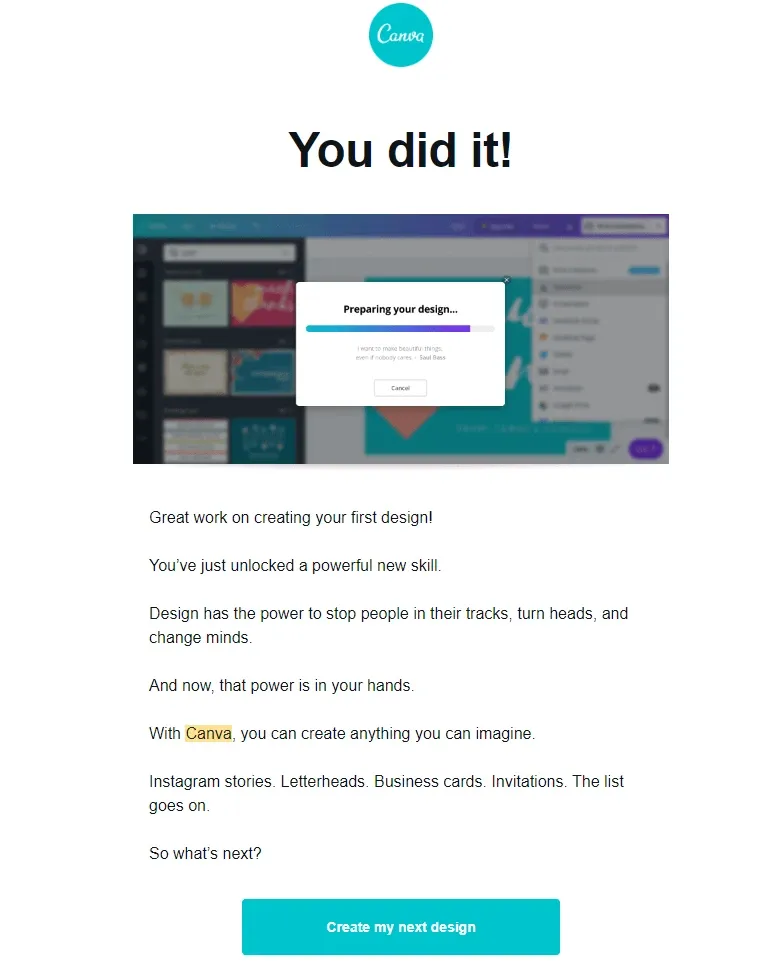
Screenshot from Canva
Notice how the designer has used white space to highlight the CTA button in this email.
6. Pay attention to typography
Your choice of font can say a lot about your brand. For example, a serif font like Times New Roman is typically seen as traditional and professional, while a sans-serif font like Arial is seen as modern, chic, and clean.
When choosing a font for your emails, be sure to:
- Choose a legible font. The most important thing is that your recipients can read your email easily. With that in mind, avoid using decorative or fancy fonts. Stick to simple, easy-to-read fonts like Arial, Times New Roman, or Verdana.
- Keep it consistent. Once you've chosen a font, stick with it. Use it for all the text in your email, from the body copy to the headers. This will help create a cohesive and professional-looking email.
- Test your fonts. Not all fonts are created equal. Some fonts may look great on your computer but be unreadable on other devices. That's why it's important to test your email on different devices before you send it out. This will help you ensure that your recipients can read your email no matter what device they're using.
Read more: Top 19 Site to Download Free Fonts 2022: Personal & Commercial
Here’s how much difference your email font can make:

Image from Kinsta
If you’re wondering how much of a difference 6.9 minutes can make, the average user spends only 10 seconds reading a brand email.
7. Use color thoughtfully
Color is a great way to add visual interest to your emails and make them more engaging. However, you should choose your colors carefully.
In addition, it’s important to stick to 2-3 colors at most. Any more than that can make your email look cluttered and difficult to read. It’s also important to choose colors that complement each other. This will help create a cohesive and professional-looking email. But the most important thing here is to choose a palette that is consistent with your brand’s overall design.
Finally, it’s a good idea to avoid bright colors. These can be difficult to read, especially on mobile devices. Instead, stick to more muted colors like black, gray, or white.
Here’s how Jomo uses a simple two-color combination to create a clean email:
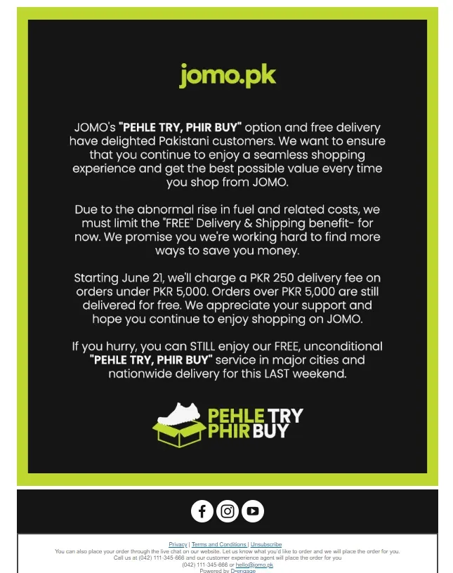
Screenshot from Jomo
This color palette is consistent with the company’s overall color scheme.
And that’s a wrap!
Email marketing is a powerful tool, and although most email builders have basic email design features, every marketer should work with a designer to boost their campaigns. By following the tips we’ve outlined, you can create emails that are both beautiful and effective. Have you tried any of these techniques in your own email campaigns? Let us know how they worked for you!
Связанные статьи