How To Use Color Correctly In Product Photography
Этот контент еще не переведен на Русский. Мы покажем вам английскую версию ниже.

Image from Unsplash
Color plays an important role in any form of visual art. And while some people might not consider product photography to be the height of fine art, it’s still a creative discipline that requires a deft knowledge of composition and color combinations.
The right colors can take average product photography to the next level of brand excellence, using clever tone combinations and placements to help each item really pop.
But if you lack experience with color or are just starting in the product photography industry, the prospect of using color as a tool for enhancing your body of work may feel overwhelming. In this post, we’ll break down the basics to help you make better creative decisions going forward.

Image from Unsplash
Learn The Basics Of Color Theory With A Color Wheel
If you want to learn more about color theory and don’t know where to start, look at the color wheel. The color wheel has been used by artists and designers since the 17th century and can provide powerful insight into curating combinations that are appealing to the human eye.
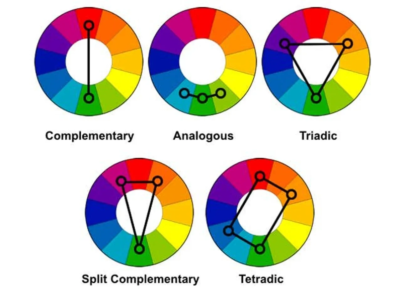
Image from Wikipedia
- Complementary colors – colors from directly opposite ends of the wheel, often naturally pairing well and enhancing one another
- Analogous colors – also known as “cousin colors” three colors that sit next to each other on the wheel and just feel right together
- Triadic colors – three colors equally spaced out on the wheel (ex: red, blue, yellow)
- Color blocking – using colors from just next to the opposite sides of the wheel to create bold, almost shocking contrast
These four terms all refer to the main theories that have evolved from the color wheel. When planning a product photography shoot, you can use one of these strategies to develop a balanced and aesthetically pleasing combination of colors.
But while bearing all this in mind, it’s also worth pointing out that just about any color can complement another in the right shade and tone. Don’t be afraid to experiment with your own unique palette combos. Just be sure to do it on your own time, not on your client’s.
Utilize Colors to Evoke Emotional Responses
Colors may just be scattered light, but how our eyes and brains interpret them can have a powerful impact on mood and emotion. In branding, color theory is used to evoke certain feelings or associations that make a product or business more appealing to the target audience.
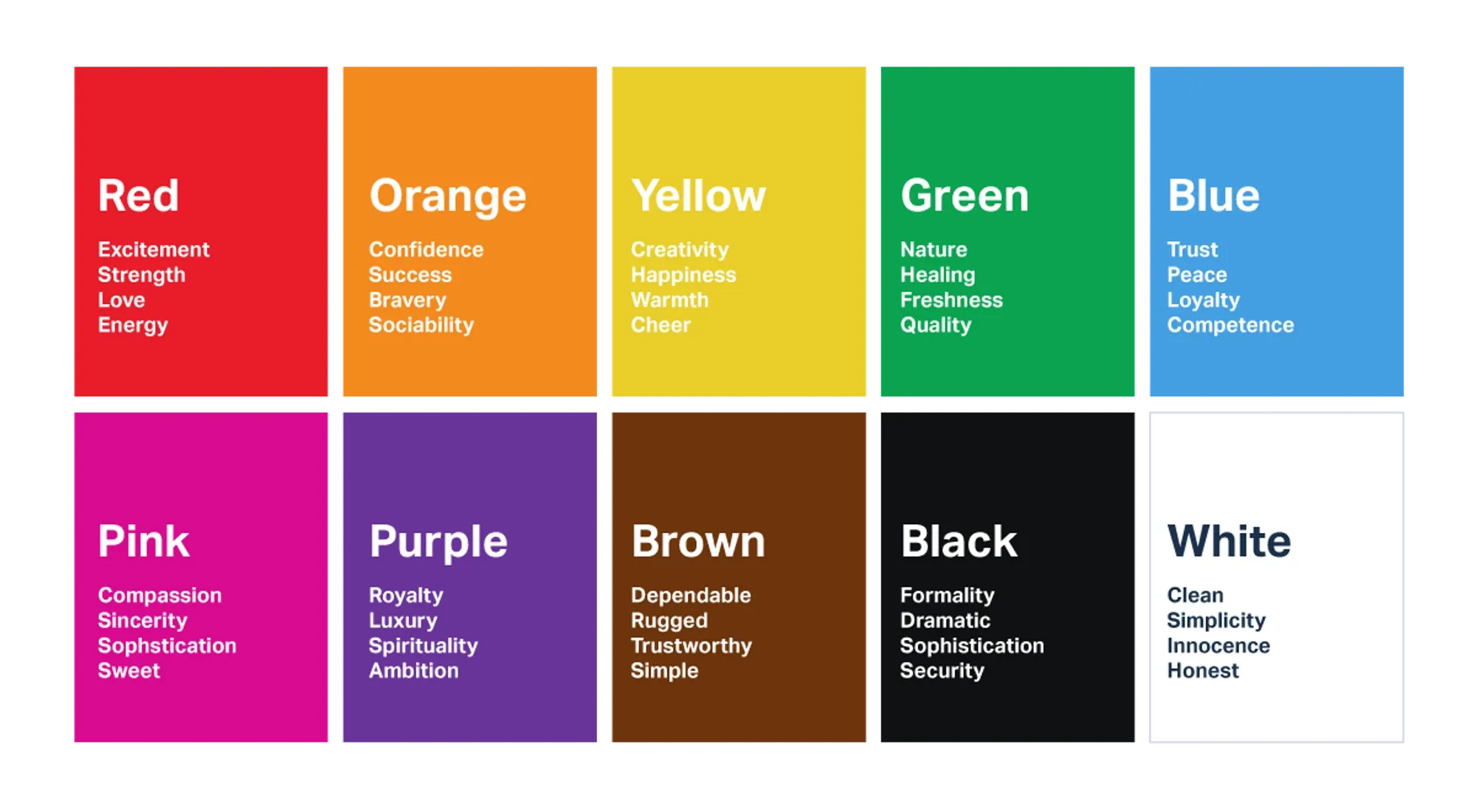
Image from UserTesting
Here are some popular colors brand use to evoke a response, along with their strongest emotional associations:
- Red – passion, excitement, anger, high energy, hunger
- Orange – creativity, enthusiasm, fun, warmth
- Yellow – happiness, friendliness, cheerfulness, childhood
- Green – vitality, health, wealth, nature, growth, balance
- Blue – calm, cold, trust, communication, safety
- Purple – spirituality, luxury, mystery
- Black – elegance, power, sophistication, seduction
- White – innocence, minimalism, cleanliness, purity
The more you understand color psychology and human interpretation, the easier it will be to produce product photography that is more compelling to consumers. You can and should use color to stimulate certain responses so as to encourage consumers to take action.
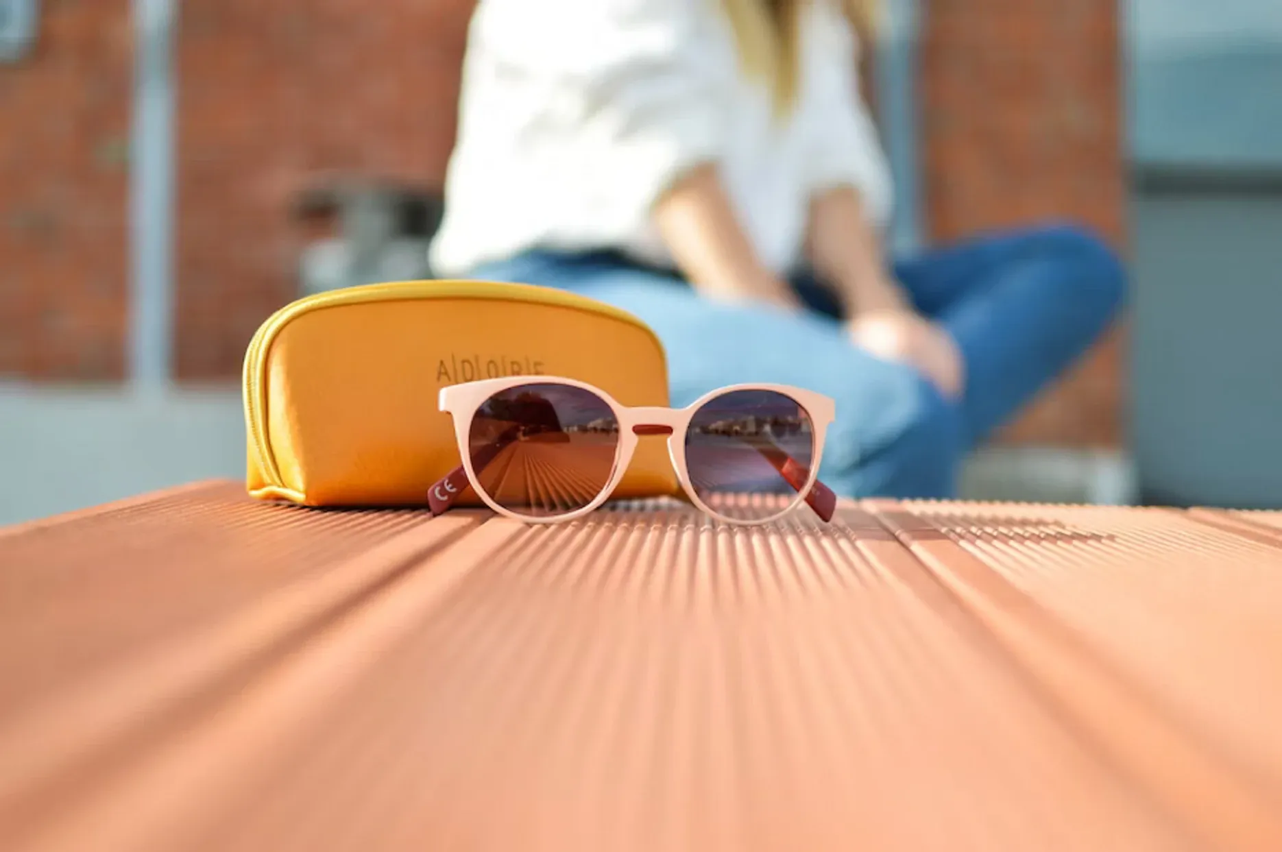
How product photography may evoke emotions/ Image from Unsplash
Using Color In Product Photography: Do’s And Don’ts
When it comes to product photography, every item, color choice, and composition must be intentional. You only have a few seconds to make an impression on your audience, so it better be good.
Do:
Use brand-aligned colors
The first thing you need to do when planning out the color scheme for a product shoot is to assess the colors of the brand and the product itself. You can’t move forward until you know what you’re working with. Get a good feel for the product you are selling and how its colors align with the brand in question.
-
Use complementary colors
Generally speaking, complementary colors are the most appealing to the human eye. If you’re feeling lost about which shades to choose, opt for a complementary combo. This will help your product to appear more balanced compositionally and increase your consumer’s desire to get a closer look.
-
Research color inspiration
Once you know more about your product, its brand, and the colors you’re interested in using, perform some creative research to inspire you. Use popular combos and previous shoots as references for the image you’d like to create and build up a library of visual references.
-
Use a color palette to guide you
If you’re still not feeling confident about your color-matching skills, don’t stress. There are lots of ways to create amazing, balanced palettes without your own input, such as using a color palette generator app. All you need to do is pick a base color and let data do the rest.
Don’t:
-
Overcrowd your colors
In the product photography industry, too many colors are a much bigger problem than too few. Don’t go color-crazy on your product photos. Pick two to three base colors that work and use them to enhance the appearance of your product. Draw consumers in with something balanced and simple.
Use color blocking unless you’re a pro
Color blocking is VERY hard to pull off unless you’re a professional color theorist, artist, or designer with years of experience. While there is a time and place for this provocative combination, it’s rarely going to be a product shoot. Stick to what you know and can rely on to look good.
Trust your opinion alone
Sometimes, you just need another person’s perspective to confirm or deny whether something looks good. If you’re a beginner, ask a professional product photographer to give their opinion on your color grading skills before publishing your work.

Image from Unsplash
Consider the Interaction Between Lighting And Color
When looking at your product photos post-shoot, you might notice that the colors you originally thought you captured turned out rather differently on camera. There are a variety of reasons why this happens—and most of them pertain to light. Light and color always go hand in hand when it comes to photography.
Lighting can be used to enhance, dim, or otherwise manipulate the way that the eye interprets color. Therefore, it deserves a spot on this list for anyone wanting to make the most of color theory.
There are lots of different ways to use lighting as a tool for influencing color quality. Here are three tips for harnessing the nature of light to produce clearer, higher quality, and more consistent photographs.
Use calibration hardware
Color calibration is a term that refers to the process of measuring or adjusting the color response of an object to its environment. Color calibration hardware is the technology that corrects the lighting of an environment based on the ambient light in the room.
For example, a snowy environment will create blue ambient light in your photographs, while fire or a warm lightbulb will add an orange hue. If the ambient light in your photo is too strong, it could warp the color of your products—which can be a problem for brand messaging and representation.
Calibration technology typically comes in the form of a color-checking tool that detects which colors are present in your frame, thereby giving you insight into what color tones require adjustment.
Use calibration software
If you don’t have a color checker, don’t fret. There are other ways to make your product photography stand out with exceptional color resolution. Calibration software performs an almost identical function, and it’s arguably easier to access than a color-checking device.
Adobe’s free DNG is one of the best options for color calibration software. But if you don’t use PhotoShop, you’re not on your own. These software programs are equally good:
- Windows Native
- Calibrize
- Quick Gamma
- CalMAN Color Match
These various forms of color calibration software will help you identify essential color corrections and adjust the hue of both products and their environment at the click of a button.
Try different screen types
This one might require a little more manual effort, but the result can be surprisingly effective. Testing the way your images look on multiple different screen types can give you insight into the color gradings at play and what might need to change in order to improve the calibration.
This is because different screens and devices have their unique way of presenting color and tone. So, by taking turns viewing your photos on a laptop, smartphone, and tablet, you can gain a broader perspective on the colors you captured and take a more informed approach to tonal editing.
Even if you have a color checker or color calibration software, trying out different screen types is never a bad idea. Especially if you know what kind of device the product’s brand is most likely to be viewed on.
Understanding Dominant Versus Recessive Colors
Not many people know that you can separate colors into either a dominant or recessive category. That’s DNA, isn’t it? Well, yes, but it’s color theory too.
When it comes to visual art such as painting or photography, you will find that some colors are more likely to “pop”, and others are more likely to fade into the background. Now, obviously, you have to take into account the vibrance and quality of those colors, but generally, this is how it goes:
- Dominant colors: red, orange, and yellow
- Recessive colors: blue, green, and purple
You might notice here that the colors listed as dominant are all warm, while those in the recessive category are cool. This is because warmer colors tend to draw our attention faster than cool colors.
It’s still important to understand that any color can “pop” in a photo, and with the right composition and tone, any color can be the star of the show. But learning about dominant and recessive colors can help you create images that are more visually compelling to the human eye.
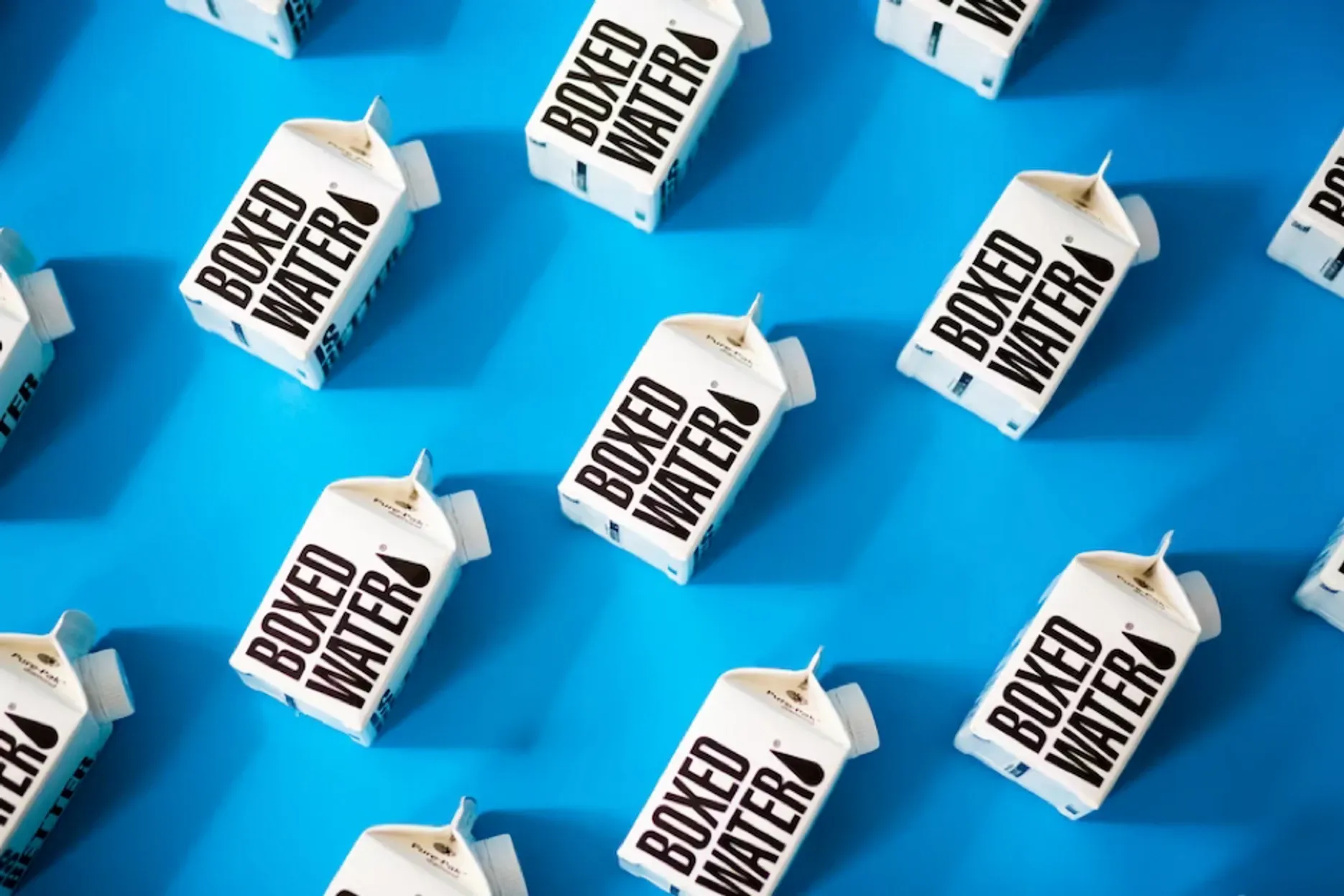
Image from Unsplash
In Conclude: Best Practices for Color In Product Photography
Color and photography go hand in hand, but learning how they interlink isn’t something that happens overnight. Great color grading, product composition, and lighting take years of experience to get right. But you can jumpstart your knowledge in this area by taking a look at these best practices.
Use color to draw attention to the product
As a product photographer, your job is to make your client’s products look the best that they possibly can. And color can help you achieve that.
If the product you are capturing already has a lot of color in it, use tones and lighting that naturally complement it (and use your newfound color theory skills to do so).
Utilize editing software to its full potential
A huge portion of color grading happens in post-production. If a product shoot isn’t going the way you envisioned, don’t stress. You can make major changes to the quality and color calibration of a photo with a professional photo editing program.
Incorporate bright backgrounds into simple products
If the products are on the more simple, minimalistic side, you can still enhance their appeal by using a colorful background. In fact, sometimes a simple product means you have more freedom to play around with creative backdrops, colors, and textures.
Understand your product briefing
When it comes down to it, one of the most important things to know about color and product photography is to gain a thorough understanding of the product and brand brief.
The more you know about your target audience, brand identity, and general product intention, the easier it will be to create compelling photos. You need an emotional and cultural context to inform your creative decisions and to help you produce content that your clients and their audience will love.
Example of “good” product photography/ Image from Unsplash
Use Color To Your Advantage
Product photography plays a crucial role in the success of a brand. And in order to showcase your products in the best light possible, color must be used as a tool for natural visual enhancement.
Color theory may seem daunting at first, but just like every other skill, once you know the basics, you can avoid common mistakes, and run with it. With a deeper understanding of how color works and how consumers are likely to interpret it, you can take your product photography to the next level of success.
Связанные статьи