Color Psychology in Design: How Colors Impact User Perception and Experience
Этот контент еще не переведен на Русский. Мы покажем вам английскую версию ниже.
A universal language transcending borders, cultures, and epochs, color carries a profound impact on human perception and experience. Its pivotal role in design is unquestionable, shaping user interaction, attitudes, and emotions. In an era dominated by digital experiences, a comprehensive understanding of color psychology is essential in delivering impactful, user-centered design. In this article, we'll delve into the crux of color psychology in design, its influence on user perception, and practical tips for employing it effectively.
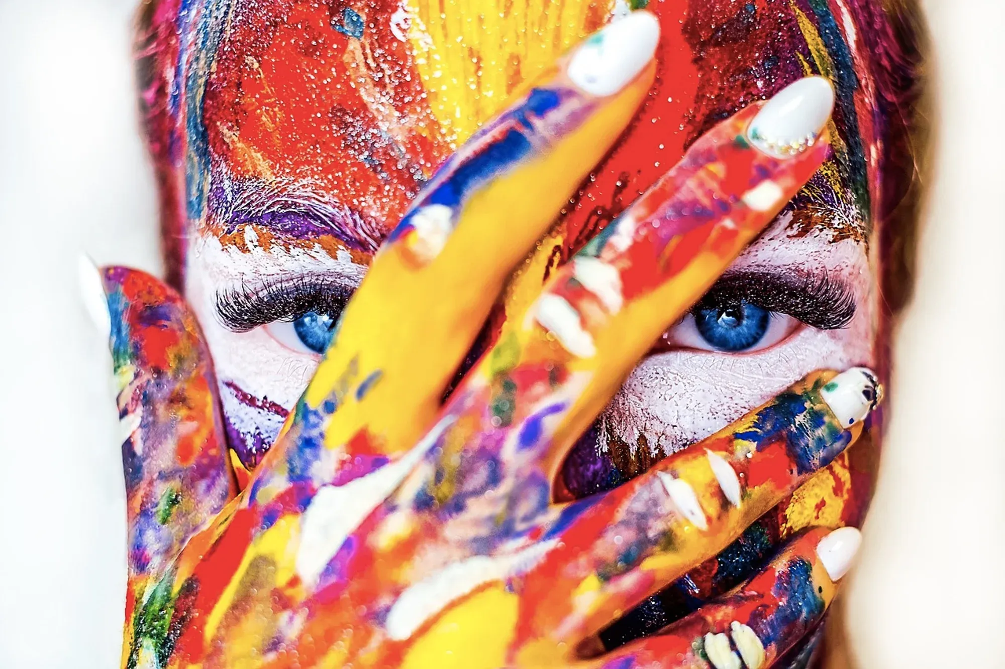
Image from Pixabay
A Deeper Dive into the Role of Color in Design
Color is one of the most powerful tools in a designer's toolkit. Much more than mere decoration, color can be used to communicate information, evoke emotions, and guide the user's eye. Let's take a closer look at the role of color in design.
Communication
The first and most fundamental role of color in design is communication. Color can convey meaning both symbolically, through cultural connotations, and practically, by attracting attention or signaling action.
For instance, red is often associated with energy and urgency, while blue communicates trust and calmness. Similarly, we intuitively understand that green signals 'go,' and red means 'stop' - a principle employed in everything from traffic lights to website buttons.
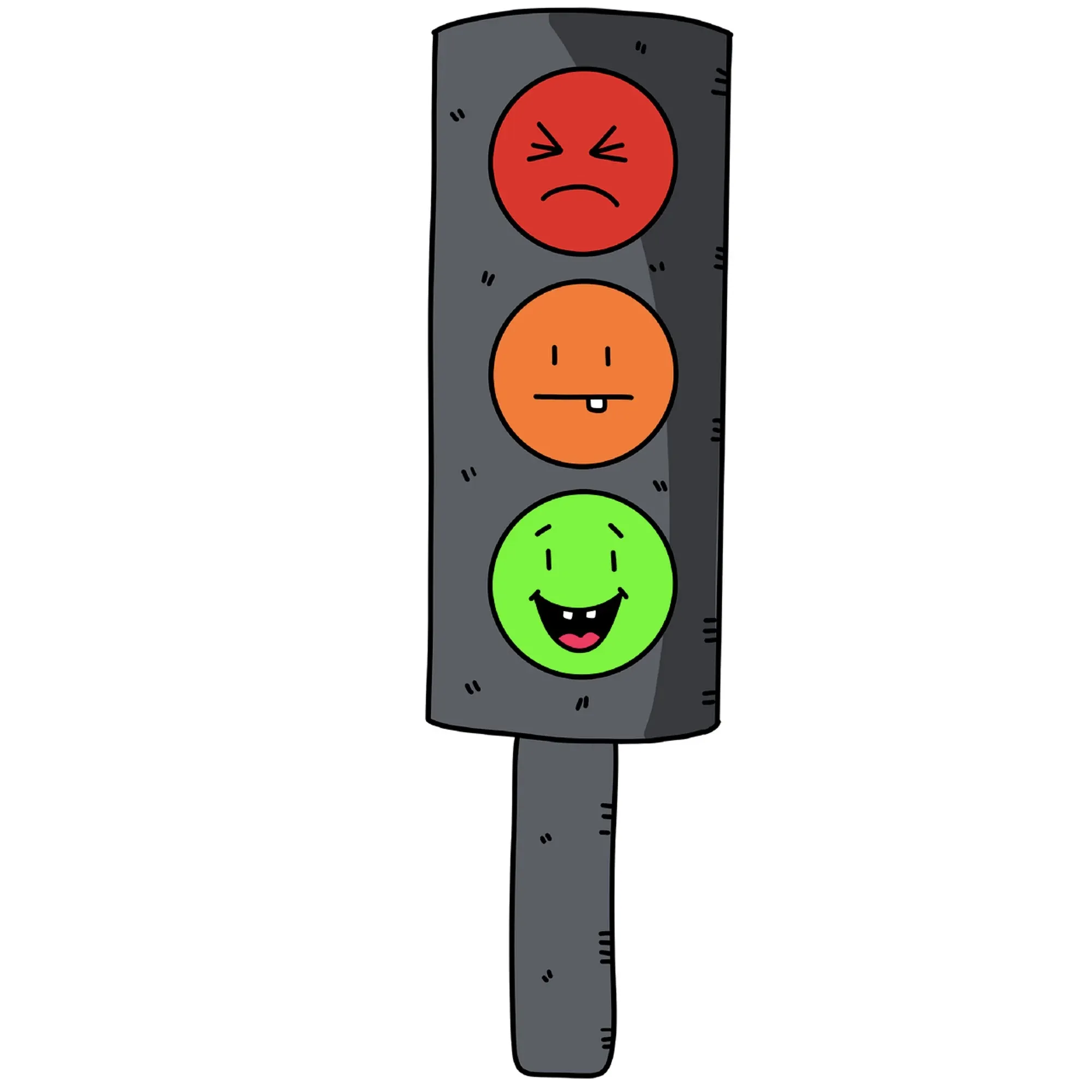
Image from Pixabay
In the digital sphere, color can communicate the function of various elements. Light grey text might indicate a disabled function, while a bright, contrasting color could draw attention to a primary call-to-action button.
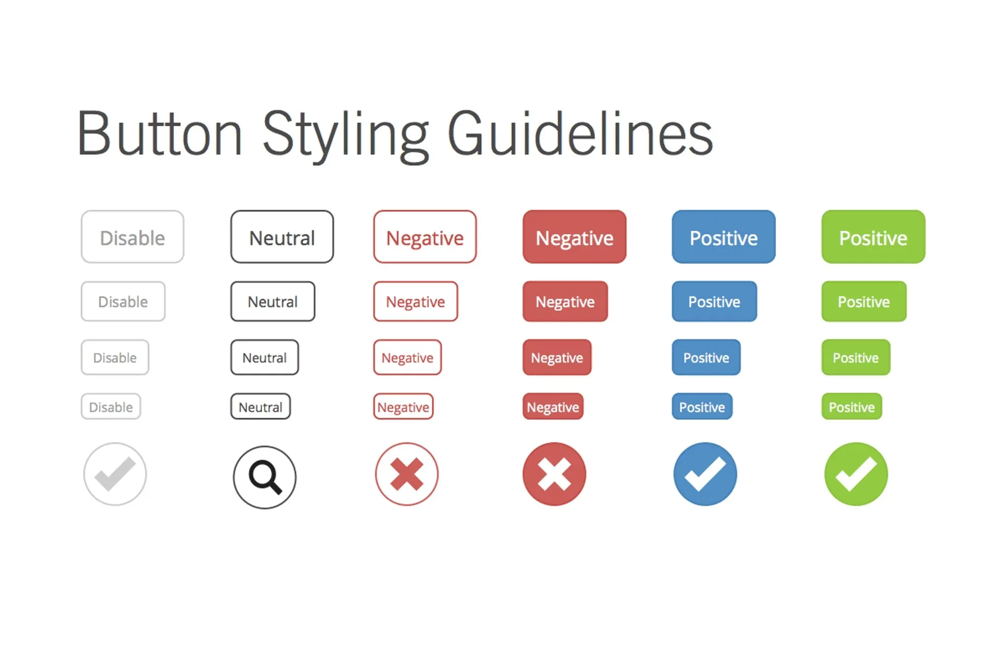
Image from CourseUX
Emotional Impact
Colors have a profound impact on our emotions. Different hues can evoke a spectrum of feelings, from excitement and joy to calmness and tranquility. By selecting colors that align with the intended mood of a design, designers can create a visceral and emotional connection with users.
A childcare website might employ a vibrant palette of bright, playful colors to reflect its youthful, energetic brand, while a meditation app might opt for muted, soothing colors to evoke a sense of calm and relaxation.
Hierarchy and Readability
Color is a crucial tool for establishing hierarchy in design. By using different colors or color intensities, designers can guide the viewer's eye and indicate which elements of a design are most important.
A web page, for example, might use a bold, contrasting color for headlines to draw the viewer's eye, with subheadings and body text in softer, more muted colors. This use of color helps users intuitively understand the structure of the page and where to focus their attention.
Moreover, the right color choices can also improve readability. High-contrast combinations such as black text on a white background or white text on a dark background make the text easily legible.
Brand Identity
Finally, color plays a crucial role in establishing a brand's identity. The colors a brand chooses to represent itself can convey its personality, values, and market positioning.
Think about Facebook's distinctive blue logo, Tiffany's iconic blue box, or McDonald's red and yellow color scheme. These color choices are instantly recognizable and evoke specific associations and feelings related to the brand.

Image from Tiffany
The Psychology of Color
Color psychology is the study of hues as a determinant of human behavior. Different colors elicit various psychological reactions, feelings, and mood states. Here is a quick breakdown of color associations:
Red: Associated with energy, passion, danger, strength, and excitement. Red can draw attention and elicit strong emotions.
Blue: Symbolizes trust, calm, stability, and reliability. Commonly used in corporate and technology designs to evoke a sense of security.
Green: Represents nature, growth, health, and tranquility. It's often used in environmental and health-related designs.
Yellow: Symbolizes happiness, warmth, and optimism. However, it can also signify caution.
Black: Associated with power, elegance, sophistication, and mystery.
White: Symbolizes purity, simplicity, and cleanliness.
Color Psychology in User Experience (UX) Design
UX design aims to enhance user satisfaction and interactions by improving the usability and accessibility of an interface. As a design component, color significantly influences these factors.
Image from Pixabay
Emotional Impact
Color has a potent influence on our emotions. A thoughtfully designed color palette can evoke the right feelings among users, influencing their perception of the brand. While a vibrant red could stimulate excitement or urgency, a cool blue might instill a sense of calm and trust.
Usability and Navigation
Colors also play a critical role in usability. They can guide users through a digital interface, highlighting key elements like call-to-action buttons or notifications. By using contrasting colors, designers can direct users' attention to specific areas, facilitating navigation.
Color Psychology: Further Implications for Branding and Marketing
Color psychology in branding and marketing extends beyond mere aesthetic appeal. It constitutes an essential element of visual communication, shaping consumer perceptions, differentiating brands from competitors, and driving customer decisions. Let's explore this further.
Influencing Consumer Behavior
Color psychology can have a significant impact on consumer behavior and decision-making. Certain colors can evoke specific emotions in consumers, subtly influencing their interactions with a brand and their ultimate decision to purchase a product.
Using warm colors such as red and yellow in advertisements can create a sense of urgency, motivating consumers to make a purchase. On the other hand, using cool colors like blue and green can create a sense of tranquility and trust, helping to build long-term customer relationships.

Image from Logo Maker
Differentiating from Competitors
In crowded marketplaces, color can help a brand stand out from its competitors. Choosing a distinctive color palette can make a brand more memorable, making it more likely that consumers will remember and choose that brand over others.
Take, for example, the mobile phone industry. When most brands were sticking to standard black and silver, Nokia differentiated itself by offering mobile phones in a range of bright, bold colors, helping to establish itself as a fun, innovative brand.
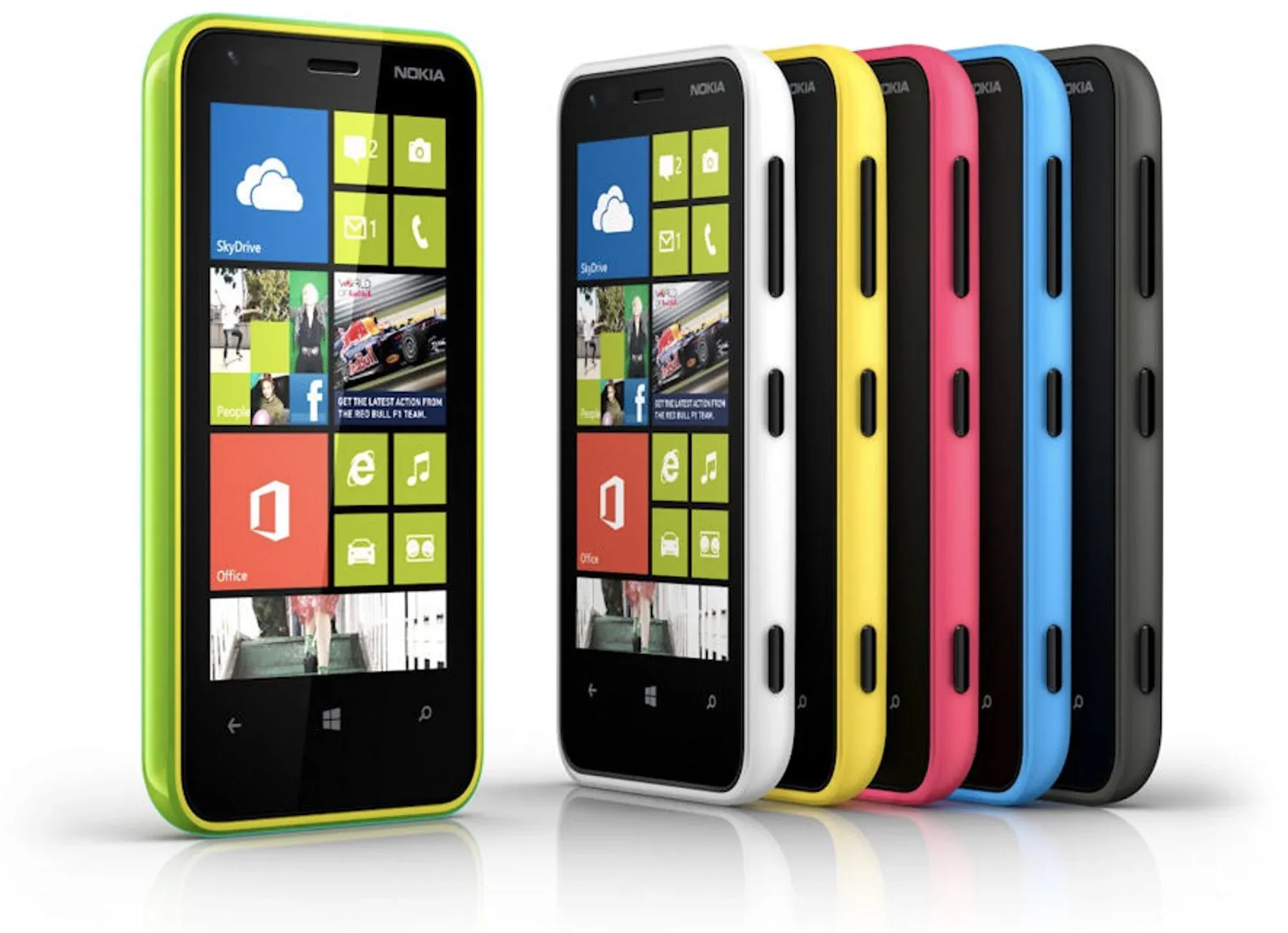
Image from All About Windows Phone
Catering to Target Markets
Finally, understanding the cultural, demographic, and personal preferences of a brand's target market is crucial in selecting the right colors. In many Western cultures, white is associated with purity and is often used in weddings, while in many Eastern cultures, red symbolizes luck and prosperity and is used in celebrations.
Additionally, research suggests that men and women may respond differently to colors. For instance, studies show that men tend to prefer bold colors while women prefer softer colors. Understanding these preferences can help brands more effectively reach their target audience.
In conclusion, color is a potent tool in the field of branding and marketing. By carefully considering color choices and understanding their psychological effects, brands can build a strong identity, influence consumer behavior, stand out from competitors, and effectively cater to their target markets.
Image from Pixabay
Strategies for Applying Color Psychology in Design
Harnessing the power of color psychology in design can create more compelling, effective, and meaningful user experiences. However, using color psychology effectively requires a strategic approach. Here's a deeper look at how to apply color psychology in design.
1. Define the Purpose and Goals of the Design
Every design project serves a unique purpose, and its goals should guide your color choices. Ask yourself, what is the desired outcome? What emotions or reactions do you want to evoke in the users? Do you want to encourage action, convey a message, or simply provide a pleasing aesthetic experience? Understanding the purpose and goals of your design is the first step in choosing an effective color palette.
2. Understand Your Audience
Different audiences perceive and react to colors differently. Factors such as cultural background, age, gender, and personal preference can all influence an individual's color perception. Thus, it's crucial to research and understand your target audience before making color decisions. A website targeting young children would likely benefit from bright, primary colors, while a luxury brand might opt for a more restrained, monochromatic palette.
3. Consider Accessibility
Inclusivity and accessibility should always be considered when choosing colors for your design. Using high-contrast color combinations can make your content more readable for individuals with visual impairments. Furthermore, consider color blindness - around 8% of men and 0.5% of women globally are affected by it. Tools like color blindness simulators can help you ensure your design is accessible to all.
4. Use Color to Establish Hierarchy
Color can be used to establish hierarchy and guide users through a design intuitively. Bold, contrasting colors can draw attention to key elements or calls-to-action. Simultaneously, secondary elements can be rendered in softer or less saturated colors, indicating their relative importance.
5. Experiment and Test
While there are broad guidelines and theories about how certain colors might be perceived, reactions to color can also be deeply personal and subjective. Therefore, it's essential to experiment with different color combinations and continually test them with your target users. Collecting feedback will help you refine your palette to create the most effective and engaging design possible.
6. Consistency
Maintaining color consistency across your designs reinforces brand identity, aids recognition, and creates a sense of familiarity for your users. This doesn't mean you need to limit yourself to one or two colors, but rather that the colors you choose should form a cohesive, harmonious palette that is consistently applied across all aspects of your design.
In conclusion, applying color psychology in design is a combination of understanding the psychological implications of color, strategic decision-making, and continual testing and refinement. It's a powerful way to enhance your designs, making them more engaging and effective in fulfilling their purpose.
Conclusion
The significance of color psychology in design is undeniable. It's a potent tool that designers can wield to shape user perception, evoke emotions, guide actions, and craft unforgettable experiences. As we've explored, color is instrumental in conveying messages, enhancing user experience, differentiating brands, and even steering consumer behavior.
Understanding the principles of color psychology and their implications is just the beginning. Application of this knowledge, coupled with a deep understanding of the target audience, context, and goals, can help designers create aesthetically pleasing, functional, and impactful designs.
However, remember that color perception can often be subjective, varying based on cultural, demographic, and individual differences. Therefore, it's crucial to remain flexible, continually test your designs with real users, and be open to adjustments. In the dynamic and diverse world of design, color psychology is not a strict rulebook, but a guiding light.
In the end, effective use of color psychology in design comes down to striking the right balance - a harmony of science and art, psychology and creativity, theory and practice. So, as you embark on your next design project, remember to let the colors speak, tell your story, and resonate with your users. After all, design is communication, and colors are one of the most powerful languages we have.

